Design the empty states first
The screen with nothing on it decides whether a product feels finished. So we start there, before the homepage and long before the busy demo.
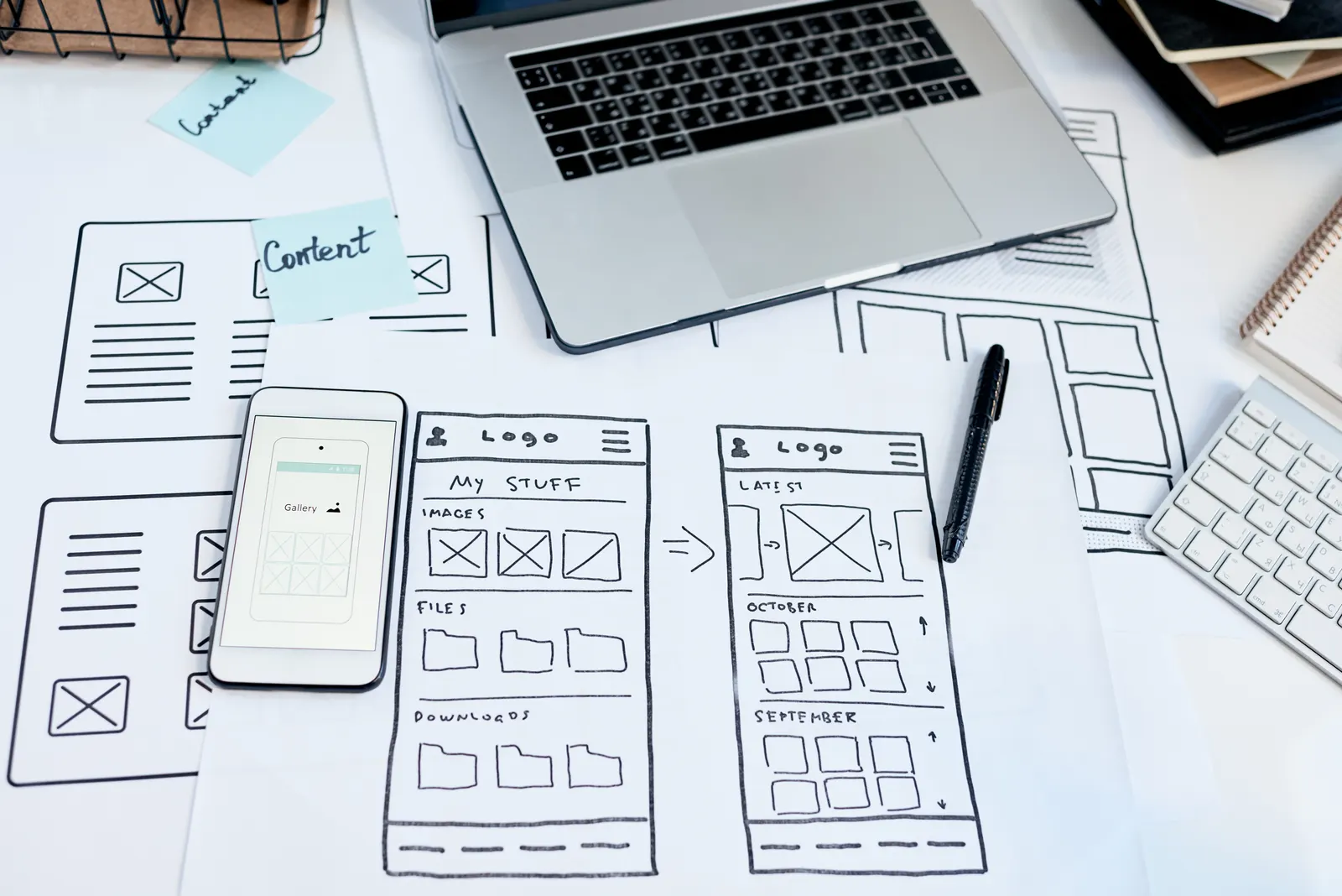
Launch-day demos are always full. Every list has ten items, every chart has a satisfying curve, every inbox has a friendly message waiting. Then a real customer signs up on a Tuesday and meets the product as it actually is: no orders, no data, no messages, and a screen that was never designed because nobody expected anyone to see it. The demo state is the rarest state a product will ever be in. The empty state is where every relationship starts.
The states nobody designs
Empty. Loading. Error. Zero results. First run. Half-complete, because the import stopped at row four hundred. Each of these is a moment when a real person is looking at the product and deciding whether it is competent. They are also the states most likely to appear at three in the morning when the automation that feeds the product hits an edge case. We have found that the products which feel finished are the ones where somebody sat with those screens on purpose.
Why starting there works
Designing the empty state forces the first question a busy screen lets you dodge: what is the one thing a person should do here? If the answer takes three paragraphs to explain, the feature is too complicated, and it is far cheaper to learn that on a blank screen than after the busy version has been built and approved. Empty states also draw the outline of onboarding for free, because they are onboarding. And they keep scope honest, since every feature has to justify itself in the moment before it has any data to show off.
What a good one does
It says what will live here, in one sentence. It offers one action, not a menu. It shows an example so the person can picture the finished thing. And it does not apologise, because nothing has gone wrong. "No orders yet. Share your link and the first one will appear here" does more work than any illustration of a sad cardboard box.
Errors are the specification
We write the error copy before the happy path. "The supplier feed did not arrive last night" is not only a message; it is a decision about who gets told, when, and what they can do about it. Working through those sentences with a client surfaces the operational rules of the business faster than any workshop, because nobody can write the message without knowing the answer.
Where it sits in our process
After the brief, before the homepage. We sketch first run, empty, error and zero results for each part of the product, agree them, and only then draw the screens with everything on them. The busy screens are easier for it, and the product ships with far fewer of the small rough edges that no client emails about but every customer feels.